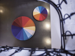
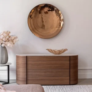
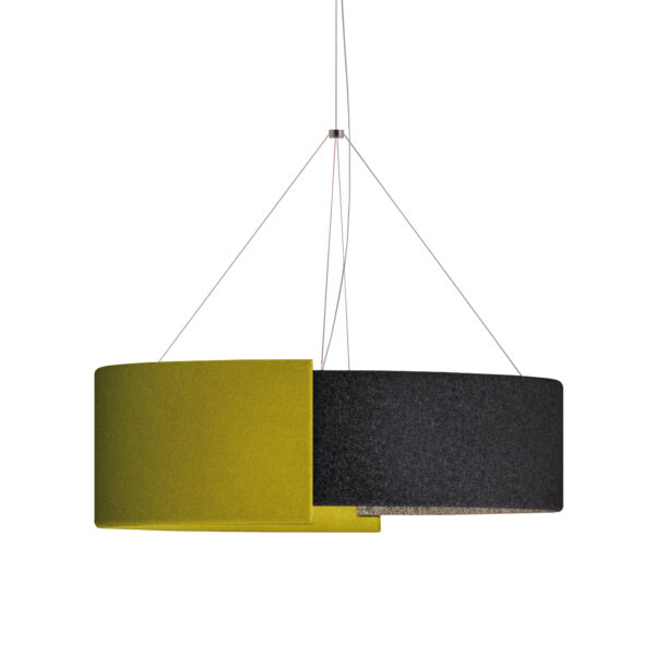
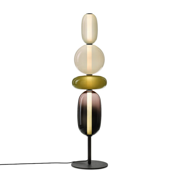
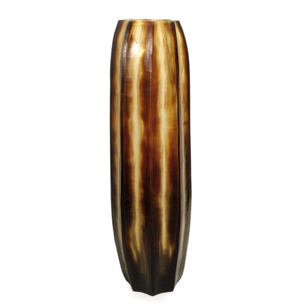
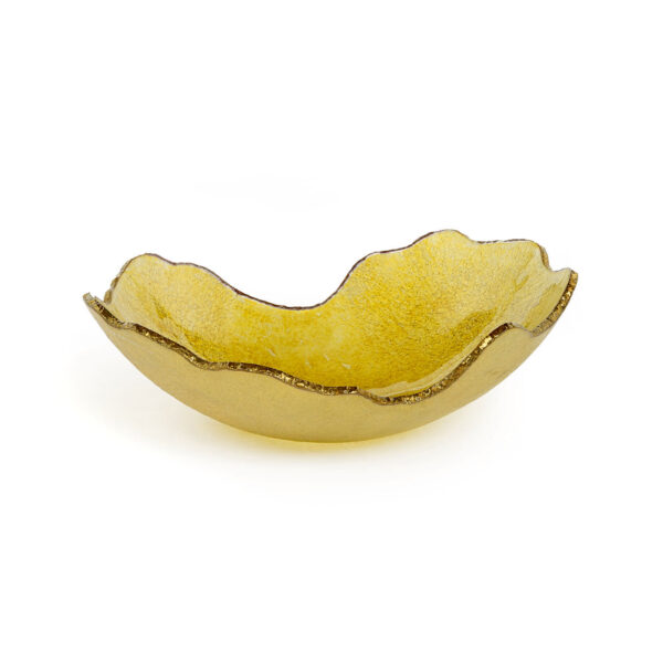
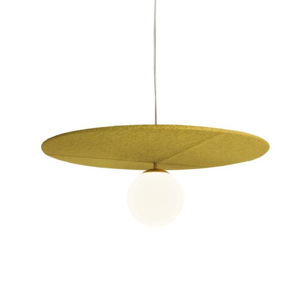
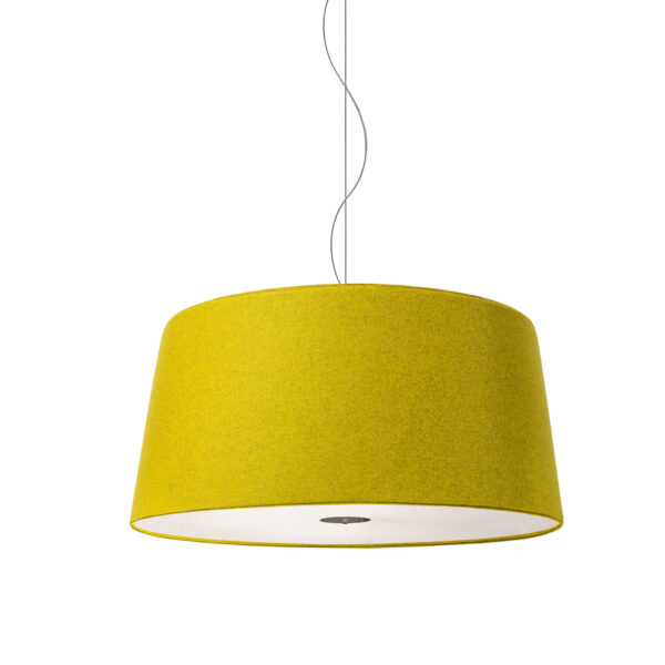
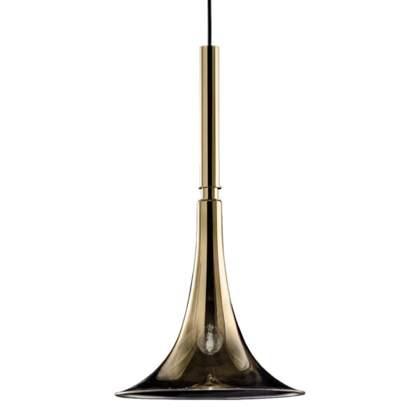
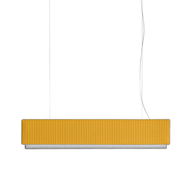
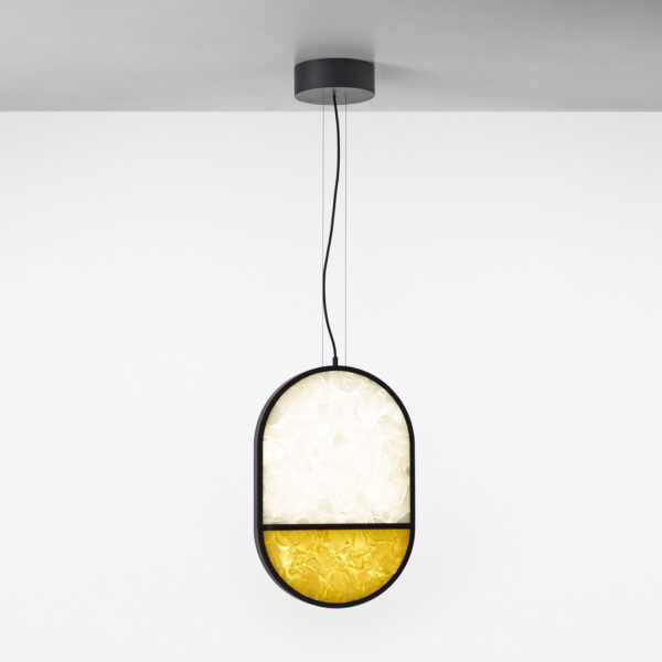
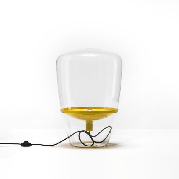
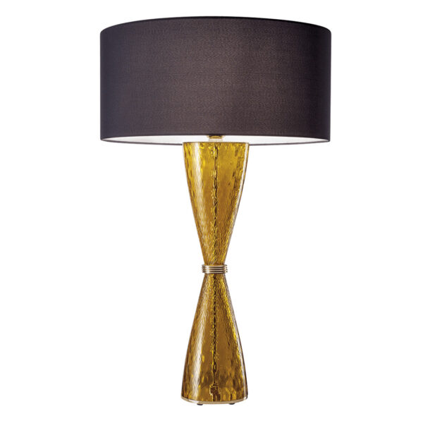
Yellow Vibes in Interior Design

The experts on colour psychology will confirm that yellow is the first colour that captivates Your eye, which means that any yellow element in Your interior styling will conquer the primary position in Your  colour palette.

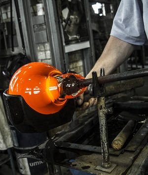
This powerful shade is bringing vibes of optimism, vibrancy and warmth into every interior it enters. The brighter shades of yellow work well in modern, clean-designed spaces while the mustard and ocher tones enhance the vintage vibe of cozy environments. The pastel and butter tones of yellow are generally non-disturbing and pleasing for the eye of curious spectators.

GEOMETRIC LIGHT OVAL FULL BOTTOM PC1143 WHITE OPAL-YELLOW BROKISGLASS BROKIS PENDANT LAMP
lacividina osaka pantone yellow illuminating
Koonam Tall ButterBrown and Smokegrey GUAXS (2)
BAFFO SUSP. ITALAMP

Versatility of Living Yellow

Yellow is the color of hope, sunshine and spring flowers such as daffodils. However, yellow is popular also as a striking color that can be used in many ways and shades to accent different rooms in Your home. From the energizing glow of sun rays to the glint of cozy textiles, or bright pop of flower decorations such as yellow tulips, this color tone is a champion in creating bold accents and contrasts.

On the other hand, for a softer and a rather calming atmosphere, tones of muted gold and amber are highly recommended.  These warmer shades are a perfect pick for creating accents in classy interiors and high-end residentials relying on softer tones of beige, taupe, cream white or light grey.

CHEERS TABLE LAMP 2400-LP Italamp G
CHEERS TABLE LAMP 2400-LG Italamp A
yellow interior design ideas righello modoluce

How to master interior styling with yellow

As with almost any colour shade, there are plenty of creative possibilities for attractive combinations and styling with the Yellow colour in your interior. While yellow has the power to bring life to muted tones such as beige, yellow can work also as a perfect match to bolder yet complementary shades such as blue, turquoise or anthracite tones.

In general, if you want to bring a brighter colour into your home in a way that’s not going to dominate , then accessories provide the perfect solution. But with yellow living room accessories, you enter a different domain.

yellow interior design hotel room Color Bratislava
yellow bedroom hotel color interior design
modern hotel room interior yellow design

Yellow hotel room interior design – Hotel Color Bratislava – Interior Architect: FMDESIGN 

Color of the Year 2021 : Illuminating Yellow and Ultimate Grey

For the choice of the Color of the Year 2021, the Pantone Institute not only did choose yellow, but like in 2016, dared to choose two colors, a combination creating a mesmerizing contrast of vibes: yellow and gray.

The two colors – together – are a testament to the ways in which we have joined as friends, family, and neighbors to bolster our communities during the crisis. They remind us of the importance of our relationships, support systems, and collective work.

The combination chosen for 2021 aims to convey a message of strength and hope, lasting and uplifting. Ultimate Gray and Illuminating (“optimistic”) Yellow are the two nuances that Pantone has announced as the colors of the year 2021. Practical and solid as a rock but at the same time warm and optimistic, the union of PANTONE 17-5104 Ultimate Gray + PANTONE 13-0647 Illuminating results in a sign of strength and positivity.

The American Institute of Color claims that the combination of these two shades will help people “fortify themselves with energy, clarity and hope” to cope with a world that will be characterized by growing uncertainty. The bright yellow hue, called Illuminating, evokes the “optimistic promise of a sunny day”, while Ultimate Gray is a much calmer shade of gray synonymous with “composure, stability and resilience”.

“The selection of two independent colors highlights how different elements come together to express a message of strength and hope that is both enduring and uplifting,” explained Leatrice Eiseman, executive director of the Pantone Color Institute. “Practical and rock solid yet warm and upbeat, this is a color combination that gives us resilience and hope,” he continued. “We must feel encouraged and edified, this is essential for the human spirit.”

GEOMETRIC LIGHT CIRCLE 1-2 TOP PC1141 AMBER BROKISGLASS BROKIS PENDANT LAMP (2)